When I was in college, I read Jean Airey’s legendary novella, The Doctor and the Enterprise. Written in the 1970s, it was a crossover between Star Trek (near the end of the Five Year Mission) and Doctor Who (between “The Deadly Assassin” and “The Face of Evil”). The text had been uploaded by Airey to Usenet in the early 1990s, I downloaded the text, and it’s been on my hard drive ever since.
A few years later, when Pocket Books began publishing the Star Trek: SCE novellas for the Microsoft Reader ebook platform, I downloaded the ReaderWorks software so I could make my own LIT files. And one of the first ebooks I made? The Doctor and the Enterprise. I like to tinker.
Eventually, Microsoft Reader faded away, and things like Nooks and Kindles became a thing, and I downloaded other tools, like Calibre. And, again, one of the first ebooks I made for my Nook? The Doctor and the Enterprise.
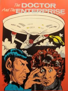
I found a cover image online to use, which you can see at the right. I believe this is the cover that was used for one of the many book printings of the story, though this was not a cover that I had.
It’s not a bad cover, but it had a problem.
Its size and aspect ratio were not good for my Kindle.
The Kindle likes images that are 2 wide by 3 high. This is closer to 3 wide by 4 high, so it’s wider than the Kindle likes.
This irritated me on occasion. I would look at my Library screen, and it didn’t fit correctly. It looked out of place. And I didn’t like the orange background, either.
I decided to do something about this.
I could edit the image in GIMP to make it better sized and proportioned for the Kindle. I could replace the background. I had the technology! I could rebuild it!
And so I did.
I fired up GIMP, loaded the cover image, and started to work.
I started by setting and Alpha channel and resizing the image to 600 by 900. Then I duplicated the layer a couple of times so I could take it apart. One layer was the artwork of Spock, the Doctor, and the Enterprise. One layer was the title. One layer was the background. One layer was the black sky in the center. Taking the title out of the image, I had to redraw the edge of the saucer and repaint the saucer, so that became two more layers. Then I cleaned the title as much as I could, but the words “Doctor” and “Enterprise” didn’t look great. I used a font tool to figure out that the Venus Flytrap font was a near match, so I replaced the two words with the text tool. Then I moved the title around until I found a place that it looked good, adjusted color levels, tried out a couple of different background colors, recentered the whole thing, and when I was happy I exported a JPG.
All told, I spent two hours and had a cleaner, better sized, and better looking cover for my own private ebook. I replaced the old cover with my new cover in Calibre, loaded the book onto my Kindle, and pronounced my work good.
I’m unlikely to reread The Doctor and the Enterprise anytime soon, but if I ever want to, my ebook will make me happy. 🙂
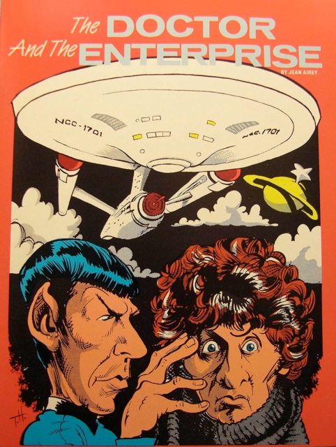
Original cover 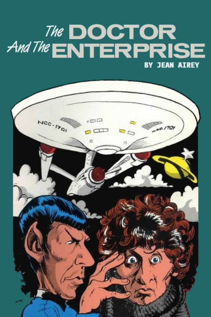
My reworked cover